
Collecting the Data
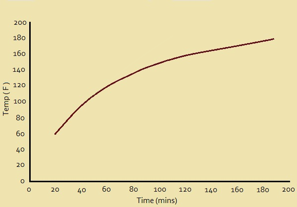
After 20 minutes, the internal temperature of our pork roast is 60° F. Twenty more minutes yields 95° F. At 60 minutes, the temperature is 118° F, whereas the temperature is 139° F after 80 minutes. At 100 minutes, we read 148° F. When two hours have passed, we obtain 156° F. 140 minutes of cooking puts us at 163° F, while 160 minutes gives 170° F. Finally, after an hour-and-a-half, we reach 175° F.
Graphing the Data
Now that we have gathered our data, we plot it in a graph of temperature versus time, and label it Fig. 1. Notice the shape of the resulting curve. Is it reasonable? To be sure.
When first put into the oven, the oven is much hotter than the oven. It should heat up quickly. The slope of the curve rises quickly.
As time goes on, however, the roast temperature draws closer to the temperature of the oven. The rate the meat increases in temperature would logically decrease and the curve would indicate that. The graph clearly represents the situation accurately.
Interpolation
At this point, we’ll introduce interpolation. For this discussion, one reference defines interpolation as “an estimation of a value within two known values in a sequence of values.”
We sketched our plot or graph, from a mere nine points, representing 9 values: after 20, 40, 60, 80, 100, 120, 140, 160, and 180 minutes, respectively. We measured the temperature of the meat at each of those times. But suppose we want to estimate what the roast’s temperature was after 30 minutes?
We didn’t actually measure the temperature then, but we can estimate what it would have been using our graph. At 30minutes, the temperature at 30 minutes, the spot on the plot lies between that for 20 minutes and that for 40 minutes. We determine that it was very close to 80° F. This answer was a product of interpolation. We have confidence in it; and justly so!
Extrapolation
What, then, is extrapolation? The same reference we previously cited defines it as “an estimation of a value based on extending a known sequence of values or facts beyond the area that is certainly known”. Is extrapolation also a useful and reliable technique for us to use?
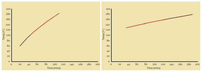
Well, consider Fig. 2. You will recognize that these two graphs feature a part of Fig. 1, with a replacement representing extrapolated guesses. Bad guesses!
Not all extrapolation is bad; however, one needs to use caution and reason carefully before putting confidence in extrapolated data. In the first of these two extrapolated plots, it might be concluded that the roast reaches 160° F in about an hour-and-a-half, instead of the two hours Fig. 1 indicates it would actually take.
On the other hand, if we use the right-hand graph in Fig.2, we might conclude that the oven was almost 120° F before we even put the roast in!
Note: You might also enjoy Microwave Cooking Hot and Cold Spots – Why?
References:
← Back to Math Logic and Design
← Home